Reports Redesign
To adhere to client confidentiality policies, I am limited in what I can share publicly about this project and can only showcase non-proprietary details of the project and product.
Client
SaaS Company
Industry
Healthcare

Redesign the entire Report’s module for the Practice Management platform
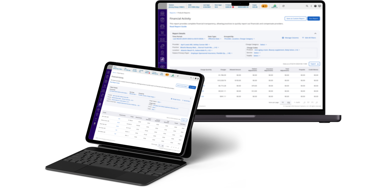
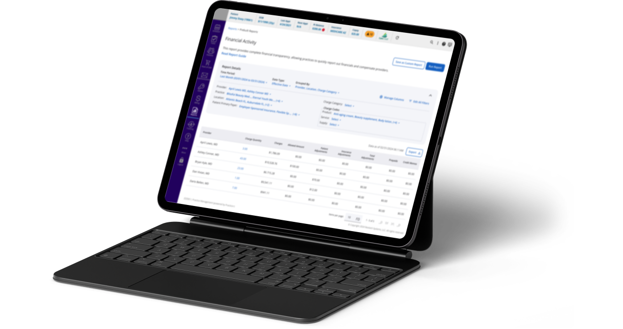
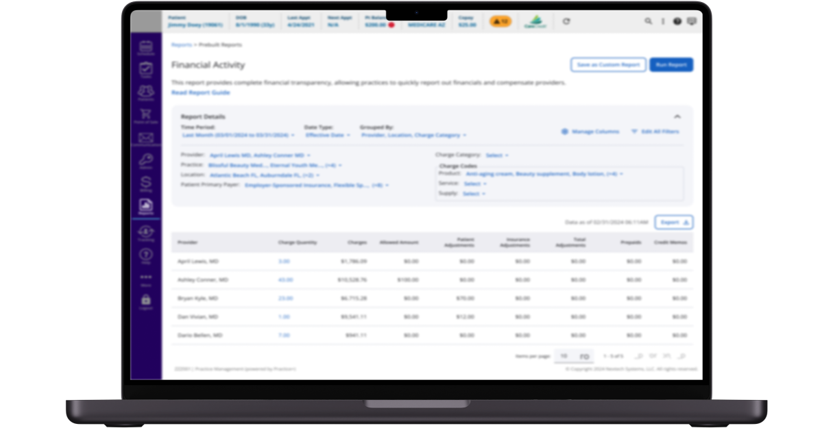
This case study explores the redesign of the Report’s module to enhance the entire User Experience while improving technical performance. For the first two phases, I reported directly to the VP of Product.
Project Timeline
January - December 2023
My Role
Product Designer
- Skills / Methods
- Research ans User testing
- Benchmarking
- Product Strategy
- Visual Design/ UI
- Prototyping
✏️ Design Process
Reseach to Understand
By analyzing support tickets and recruiting a diverse group of external users, ranging from novice to enterprise-level users with data and analytics expertise, to gain a comprehensive understanding of the user experience. This involved gathering qualitative insights and quantitative data from the platform. Additionally, we established a benchmark by evaluating features of reporting platforms and analyzing top competitors in the healthcare market to assess our position effectively.
Extreme Users - Qualitative
- 5 users within 3 to 9 months using our reports solution
- 3 expert users with Data and Analytics background
- 4 users at the management level (Directors, Managers)
- 5 users at the operational level (Billers and Technicians)
Usage Data - Quantitative
- Time spent per report
- Time to create a report
- Time to load a report
- Most used reports
- Reports with more Complains
Benchmark
- Analyzed 4 major apps for reports
- Analyzed 5 top competitors in the healthcare market
- Layout comparison
- By Features comparison

Analyze to reframe
The main pain points found:
Incomplete Information
Reports lacked clarity on purpose, with inconsistent column names across reports.
Confusing Layout
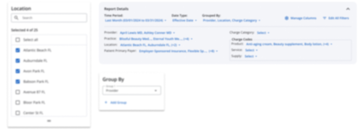
Selected filters were unclear and hidden, with inconsistent layouts across reports.
Fragmented Reporting
Users had to compare multiple reports to complete tasks due to overly specific designs.
Using the gathered information, I conceptualized solutions around three core principles:
Transparency
Clearly communicate where the data originates, how it’s calculated, and what it represents.
Trustworthiness
Build user trust through consistent design and reliable functionality.
Flexibility
Empower users to customize reports to suit their needs and workflows.

Prototyping and User Testing
The project began with multiple prototypes, starting with wireframes created during user interviews. These were presented to users at the end of the sessions to gather feedback and validate assumptions. In the second phase, we developed high-fidelity prototypes using Angular Material components to achieve the desired flexibility. The usability of these components was validated by conducting A/B testing, where 8 out of 10 users successfully created a report.

Roll Out and Early Adopters
To manage this significant change, a phased approach was implemented:
- Phase 1: Launching the new navigation and user interface for reports.
- Phase 2: Introducing all the new features and reports.
I collaborated closely with the marketing, implementation, and support teams to ensure a smooth transition and the success of this major update.
💎 Project Milestones
- Redesigned Navigation:
Streamlined navigation to reduce clicks and wait times, allowing users to preview report details before opening them. - New Components and Design Patterns:
Designed, tested, and added new components and design patterns to the Design System. These were reused across multiple projects by other designers, fostering consistency and efficiency. - Adopted Navigation Pattern:
The navigation design for this module was so well-received that it became the standard pattern for navigation across other modules.